In this tutorial we will discuss how to create dynamic Pie Chart in PHP with MySQL.
A graph which is created to display records in the proportion within a circular chart in form of sectors is known as Pie Chart. Each sector is proportion of total and total value of pie is always 100 percent.
There are other type of charts also like line/area chart and bar chart but in this tutorial we will discuss about Pie chart.
Dynamic Pie chart means that getting data from database to display in proportion in sectors. This tutorial will help you to create Pie chart for your web application.
Using the Google Chart tools we will create pie chart in PHP with MySQL. Google Pie chart tool is open source and easy to use in web application. Google have wide range of chart types and you can use as per need.
Database Table:
--

-- Table structure for table `coding_info`

--


CREATE TABLE IF NOT EXISTS `coding_info` (

  `id` int(11) NOT NULL AUTO_INCREMENT,

  `name` varchar(25) NOT NULL,

  `value` int(11) NOT NULL,

  PRIMARY KEY (`id`)

) ENGINE=InnoDB  DEFAULT CHARSET=latin1 AUTO_INCREMENT=6 ;


--

-- Dumping data for table `coding_info`

--


INSERT INTO `coding_info` (`id`, `name`, `value`) VALUES

(1, 'PHP', 35),

(2, 'MySQL', 20),

(3, 'JavaScript', 15),

(4, 'AJAX', 12),

(5, 'CSS', 5);
Table of Contents
Pie Chart Using Google Chart Tool(JavaScript, PHP and MySQL)
Index.php
<!DOCTYPE html>

<html>

  <head>

   <title>Pie Chart Demo - PHPCluster</title>

    <script type="text/javascript" src="https://www.gstatic.com/charts/loader.js"></script>

    </head>

  <body>

    <div id="piechart" style="width: 900px; height: 500px;"></div>

<?php

                   require_once 'dbconfig.php';

                $db = new database;

               //query to get record from db

                 $query = "SELECT * FROM coding_info";

                $result = $db->runQuery($query);

                //get no of rows

                $rows_count = $db->numrows($query);

               if($rows_count>0):

                ?>

                <script type="text/javascript">

      google.charts.load('current', {'packages':['corechart']});

      google.charts.setOnLoadCallback(drawChart);

 function drawChart() {

var data = google.visualization.arrayToDataTable([

          ['Coding', 'Hours per Day'],

         <?php

                                 foreach($result as $info){

                                 extract($info);

                                 echo  "['$name', $value],";

         }  ?>

        ]);

  var options = {

          title: 'My Daily Coding Activities'

        };

 var chart = new google.visualization.PieChart(document.getElementById('piechart'));

chart.draw(data, options);

      }

    </script>

  <?php endif; ?>

  </body>

</html>
Above script will help you to create simple Pie chart in PHP. Now going to see how change different behaviour in Pie chart.
Create 3D Pie Chart.
To change Pie Chart in 3D you have to set 3D option true because by default it set to false.
var options = {

          title: 'My Daily Coding Activities',

         is3D: true,

        };
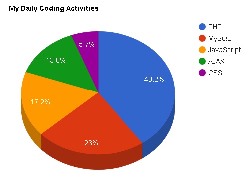
You can change Pie chart title by changing options title.
Create Donut Chart
Donut chart is a type of chart containing hole in the center. You can create donut chart by changing option value. You have to add pieHole option.
var options = {

          title: 'My Daily Coding Activities',

          pieHole: 0.5,

        };
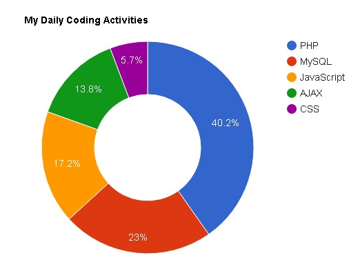
Combining pieHole and 3D option at same time, then pieHole option will be ignored.
Rotate your Pie Chart
It starts by default with left edge of first slice which point straight up. To rotate Pie chart you have to add pieStartAngle option.
var options = {

          title: 'My Daily Coding Activities',

          pieStartAngle: 120,

        };
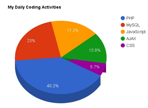
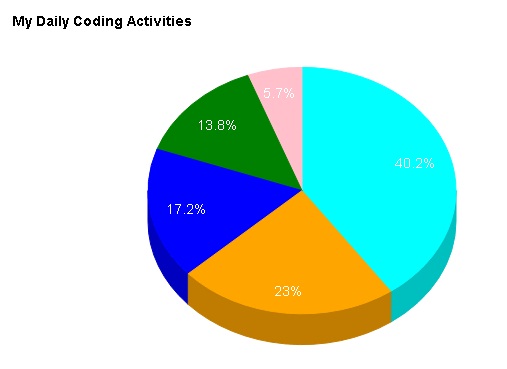
Custom Slice Color
If you want to fill custom slice color then add a color variable in option.
var options = {

          title: 'My Daily Coding Activities',

          is3D: true,

          colors: ['cyan', 'orange', 'blue', 'green', 'pink']

        };
You can add also add color code instead of color name in colors option variable value.
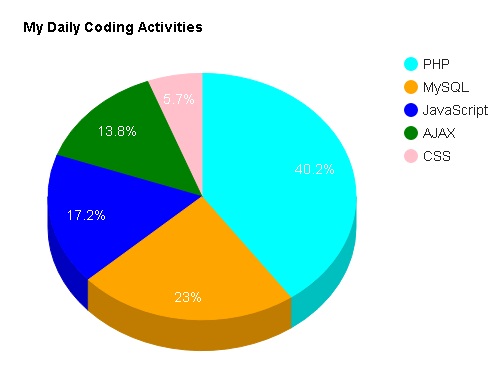
Hide Legends
By default Legends display in Pie Chart. To hide it change option value. If you want to hide add legend: ‘none’, in option.
var options = {

          title: 'My Daily Coding Activities',

          is3D: true,

          colors: ['cyan', 'orange', 'blue', 'green', 'pink'],

          legend: 'none',

        };
[sociallocker] Download Script[/sociallocker]
Now you can easily integrate this pie chart in your web applications. If you have any query regarding Pie chart feel free to write in comment box.

Nice Tutorial
Chart.js is also a nice library to show data visually I always prefer this for data visualization.
Can you please give an example a snippet of code how to use it?
Nice explanation
thank you
Keep visiting..